

 Français
 Español
 Deutsch
 Italiano
 Português
Photography vocabulary for AI images: light, lens, framing
Golden hour, 85 mm, high angle, backlit: the photo terms that transform an image prompt, with their real effect and examples to copy.
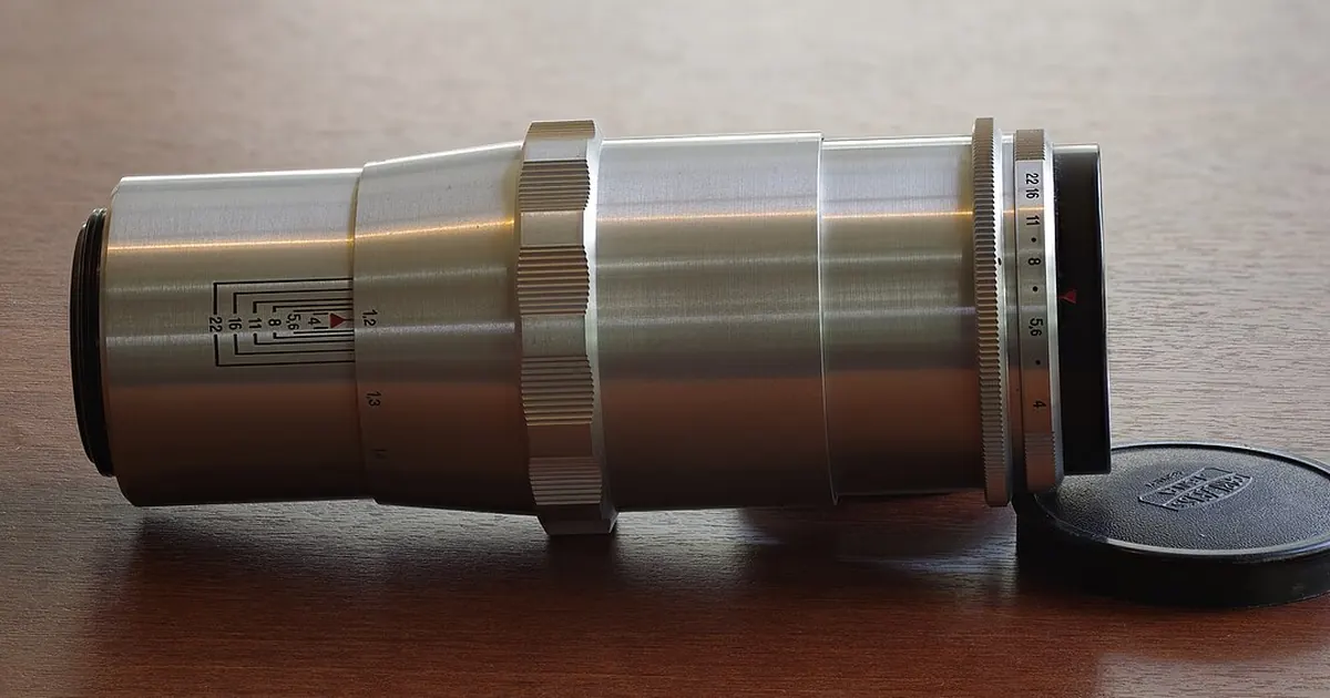
Ask for "a nice photo of a restaurant kitchen" and you'll get a catalog image: everything is sharp, everything is lit the same way, and nobody could say what you're supposed to look at. Add "hard side light coming from an open door, medium shot at countertop height, blurred background" and the same kitchen starts to tell a story.
A photographer makes these decisions before pressing the shutter. If you don't make them, the AI makes them for you, usually in the most banal way. These tools don't really simulate a camera: they learned from images paired with descriptions, and these terms steer them toward a look. So you won't get an exact lens, only a strong tendency, which is usually enough.
The terms are given in English, in code format, because English remains the safest in Midjourney or Stable Diffusion. In ChatGPT or Gemini, you can phrase them in plain sentences.
Light sets the mood
If you were to remember only one family of words, it would be this one. Two questions are enough: where does the light come from, and is it soft or hard?
| Term | What you get | Good use |
|---|---|---|
Window light (soft window light) | Soft, light shadows, very natural | Craftsperson portrait, product, interior |
Golden hour (golden hour) | Warm, low-angle, long shadows | Outdoors, tourism, real estate |
Blue hour (blue hour) | Bluish, calm, city lights on | Shop front, city |
Backlighting (backlit) | Silhouette, glowing outline | Strong image, less detail on the subject |
Hard side light (hard side light) | Contrast, pronounced textures | Materials, leather, wood, stone |
Overcast sky (overcast light) | No distinct shadows, accurate colors | Product, documentation |
Chiaroscuro (chiaroscuro, low-key lighting) | Dark background, subject stands out | Luxury, fine dining, dramatic portrait |
Very bright background (high-key lighting) | Luminous, few shadows | Health, beauty, reassuring world |
Always state the direction if it matters: from the left, from above, from behind. "Soft light" alone remains a preference, whereas "soft window light, on the left" describes a setup.
The lens sets distance and blur
Focal length says as much about your relationship to the subject as about the equipment. You don't need to know the physics, only the usual effect.
- Wide-angle (
24mm lens,wide-angle): shows a lot of space, accentuates perspective. Good for a restaurant dining room or a workshop. On a close-up of a face, it distorts. - Standard focal length (
50mm lens): close to what the eye sees, understated, documentary. - Portrait (
85mm lens): isolates the subject, softens the background. Good for a team photo or an author profile. - Macro (
macro lens,extreme close-up): shows details up close, like embroidery, a coffee bean, a weld. - Telephoto (
telephoto lens): flattens the planes, brings the background closer to the subject.
For blur, shallow depth of field isolates the subject and deep focus keeps everything sharp. The expression f/1.8 sometimes acts as a blur signal, but a clear description does just as well. A point often forgotten: these terms add up badly if they contradict each other. macro lens, wide landscape means nothing to a photographer, and the AI will decide at random.
Framing says what matters
| Term | Effect |
|---|---|
Wide shot (wide shot) | Establishes the place, the subject is small |
Medium shot (medium shot) | Subject and context in equal parts |
Close-up (close-up) | Detail, total attention |
Overhead view (overhead shot, flat lay) | Table, recipe, arranged objects |
High angle (high angle) | Subject seen from above, looks smaller |
Low angle (low angle) | Subject seen from below, looks imposing |
Eye level (eye level) | Neutral, close, natural |
Rule of thirds (rule of thirds) | Off-center subject, livelier composition |
A useful tip whenever the image has to carry text: ask for empty space (negative space on the left). An image packed to the brim is a poor fit for a banner or a cover.
Two prompts that put it all together
Here's the recipe for an image with real intent, in this case the cover of a brochure for a cabinetmaker or another manual trade. One light, one focal length, one framing, and nothing more:
photograph of [TRADE OR TECHNICAL GESTURE, NO VISIBLE FACE] in [WORKPLACE], hands and tools in the foreground, soft window light from the left, 50mm lens, shallow depth of field, medium close-up at eye level, muted natural colors, negative space on the right
Showing hands rather than a face remains a realistic choice, but check them: that's where the AI goes wrong the most. The second prompt aims at a dish photo for a restaurateur:
overhead shot of [DISH] on a [COLOR] ceramic plate, on a [MATERIAL] table, hard side light from the right, long defined shadows, macro detail on the texture of [MAIN INGREDIENT], restrained palette of [2 COLORS], editorial food photography
Be careful: a generated dish photo doesn't show the dish you serve. On a menu or a restaurant website, it can mislead the customer about what they'll receive, so reserve it for moods and illustrations, and keep real photos for your dishes.
These words work in most tools, but don't carry the same weight everywhere. The guides for Midjourney and Stable Diffusion explain how to combine them with each tool's settings.
Before/after: fixing a prompt word by word
Imagine an association that wants to illustrate its volunteer call for a food drive.
Before: people helping at a food bank, warm, professional photo, high quality
The result is likely to look like a stock photo: frozen smiles, flat light, everyone facing the camera.
After:
photograph of stacked cardboard boxes filled with fresh vegetables on a long table in a community hall, a pair of hands sorting apples in the foreground, soft overcast light through high windows, 35mm lens, medium shot at eye level, shallow depth of field, natural muted colors, documentary style
Four things changed. The subject became concrete, which avoids generating unknown, unconvincing faces. The light describes a real hall. The focal length and viewing height put the reader next to the action. And documentary style rules out the advertising look. Like any generated image, it documents no real action: if the association publishes it, it would do well to say so rather than pass it off as a field photo.
To practice, open a photo you like in a magazine and describe it using a single line from each table: light source, probable focal length, framing. Generate your description, then compare: the gap will show you which word to change, and you can iterate from there.
Read next
AI images
Effective Midjourney prompts: the method and the useful parameters
Structure, parameters, reference images and before/after: get the image you had in mind from Midjourney, not a lucky draw.
9 min read
AI images
Effective Stable Diffusion Prompts: Method, Weights, and Settings
Model choice, weight syntax, CFG, seed, and negative prompt: the method for Stable Diffusion images you can reproduce.
8 min read
AI images
Composing a scene: foreground, subject, background
Describing an AI image in three planes, with a sharp subject and a coherent background, avoids flat scenes where everything blends together. Method and a prompt to copy.
3 min read